
 Terug naar overzicht
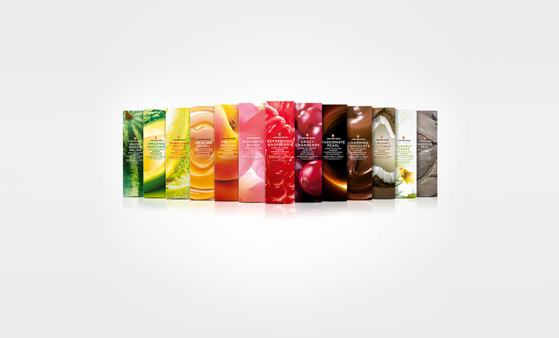
Het bijzondere design werd ontwikkeld met Joost la Housse, de beeldbewerking door Frits.
Onderstaand vind je het artikel en enkele commentaren
Jordan
Love the contrast between the boxes and the bottles. The typeface is great also!
plumbing
It's indeed a very creative product packaging.
More buyers would be attracted by its alluring colors.
Reina_elliston
These are indeed very refreshing to the eyes! I super love the raspberry photo. The movement of the water is impressive.
fred hart •
Wow, big bold redesign. I commend Dr van der Hoog for taking such risks. Clients have a tendency to be overly protective of their brand, understandably, and it's refreshing to see a change like this.