Development of a premium assortment
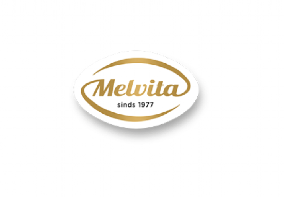
The beekeepers from de Traay asked us to create a new premium line of products for the mainstream brand Melvita. This line has to feel high quality and also entail an organic version Tevens moest het logo geoptimaliseerd worden. The Melvita branding also had to be updated.
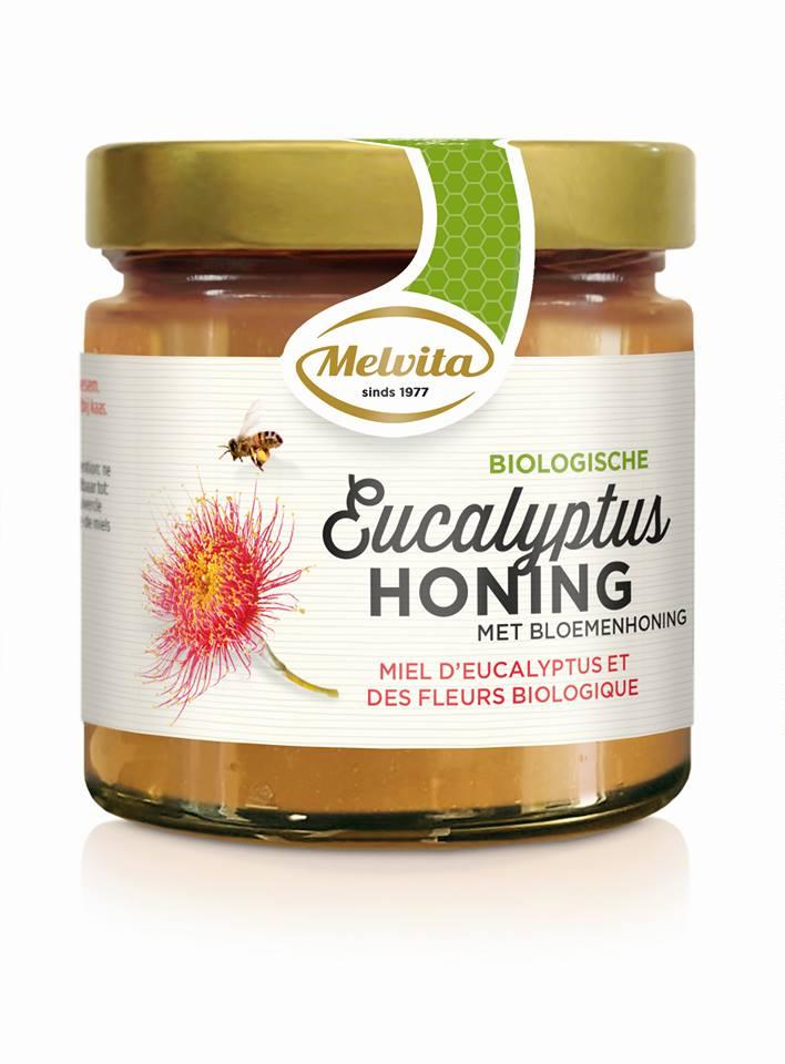
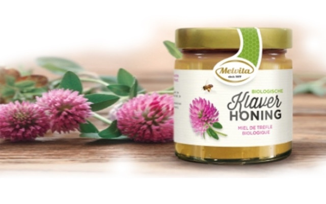
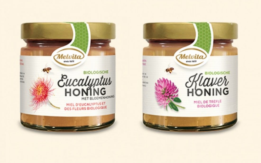
We gave the Melvita-logo a revamp. By adding a swoosh shape around the brandmark we connected the brand to the liquid product and increased the impact and modernity.
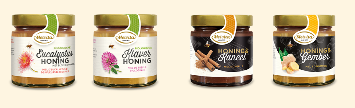
Specials and bio
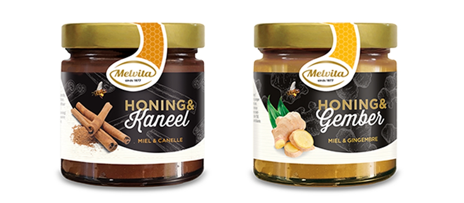
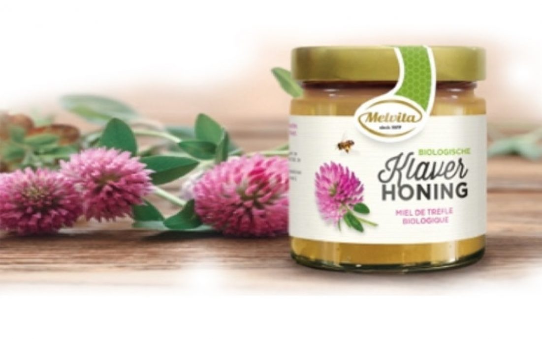
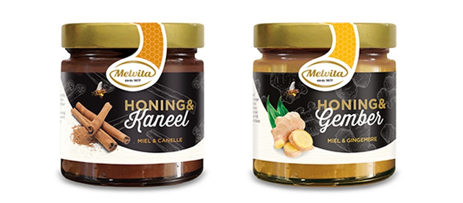
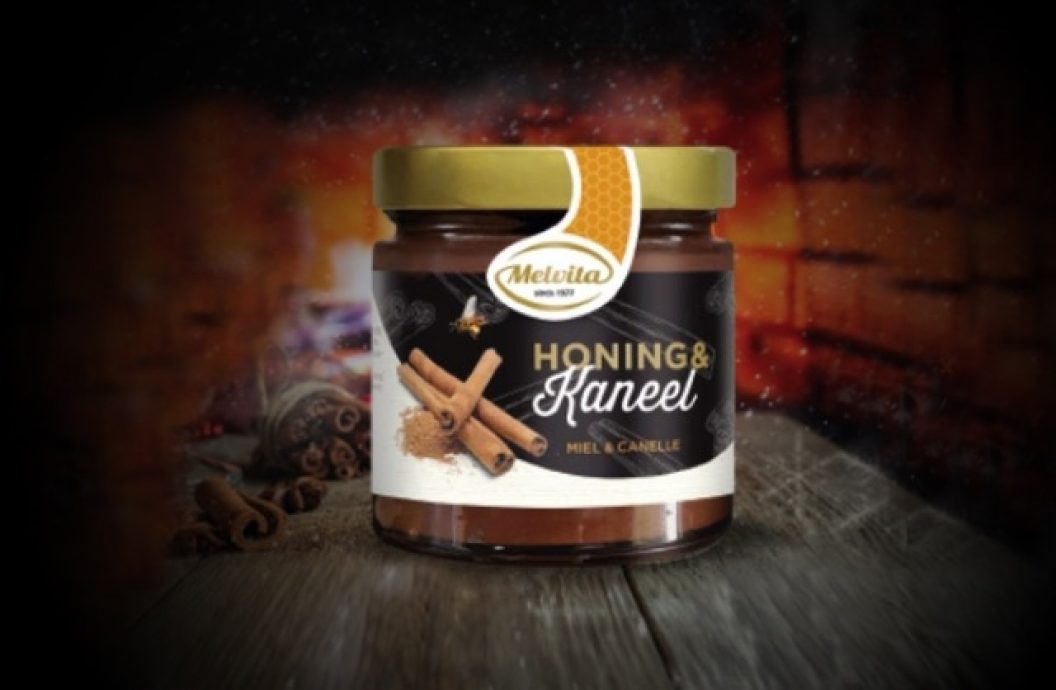
All designs are simple with many consistente elements. The specials design feels exclusive and intense by using black, gold and high quality ingredient photography. The bio design feels refined and qualitative with the use of modest ingredient photography on a creamy white background. The colourful closing seal in honey patterns lead consumers in choosing their preferred variety.