
Hero Baby Standaard Packaging design
nu: has given the Hero Baby Standard range a new look with maternal and paternal pride.
ASSIGNMENT
Hero Benelux has asked us to give the Hero Baby Standard packaging a new look that distinguishes itself more as a standard range compared to its own premium line of baby food, Hero Nutrasense. And not to lose the recognisability and softness of Hero Baby and to make the different phases more distinct.
CONCEPT & APPROACH
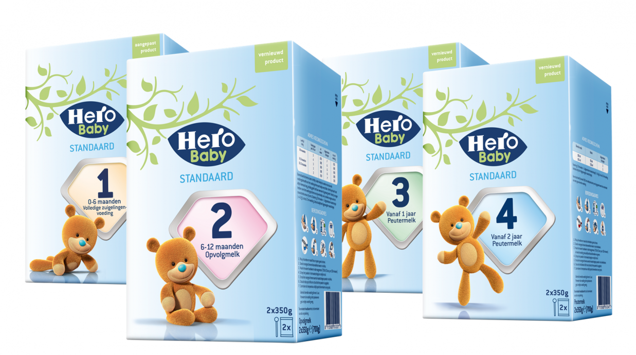
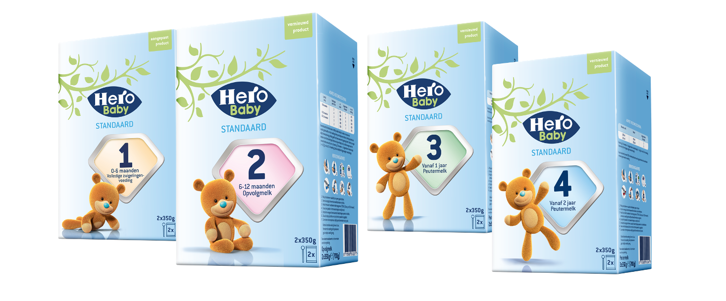
A number of Hero Baby pack icons that consumers also gave concrete and positive feedback, such as the brown bear, the 'protection shield with the numbers', the logo, have been given a central role. The distinction compared to Nutrasense is mainly sought in the color choices.
RESULT
A range of Hero Baby products with a standard appearance but also qualitative. The soft blue base color suits Hero and the baby world well and is not as heavy as Nutrasense's corporate dark blue. The brown bear occupies recognizable positions for the different phases of the baby / toddler and the large shield has its own color for each phase. The Hero logo is also said to integrate nicely and to remain upright despite the tear line of the lid.
