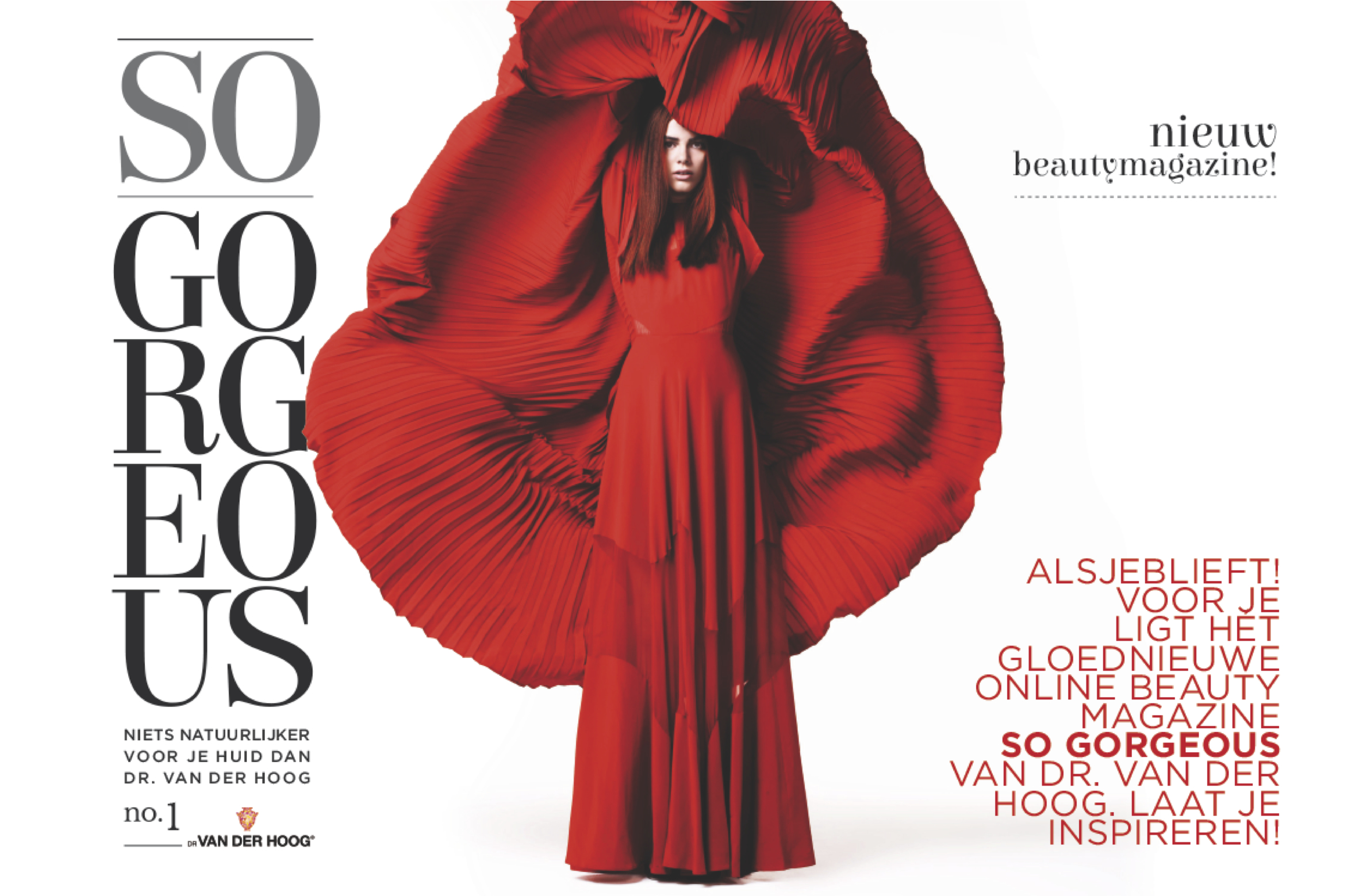


A new brand identity for the longest standing cosmetics firm in Holland
Dr van der Hoog is ready for a next phase in her 75 years of existence. Based on a new positioning nu:amsterdam was asked to develop a new identity for the whole assortment of personal care products. The job involved a revolutionary change based on vision and creativity. The objective for the brand is to radiate natural class for both the facials masks as the moisterizers category
nu:amsterdam started this project with a workshop, during which we visually analysed the brand values and competition. The first ideas brought us quickly to a full design concept. In combination with the new logo we created the first packaging design concepts with a clear architecture for the different product categories, varieties and skin types
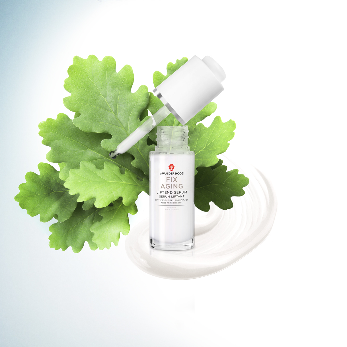
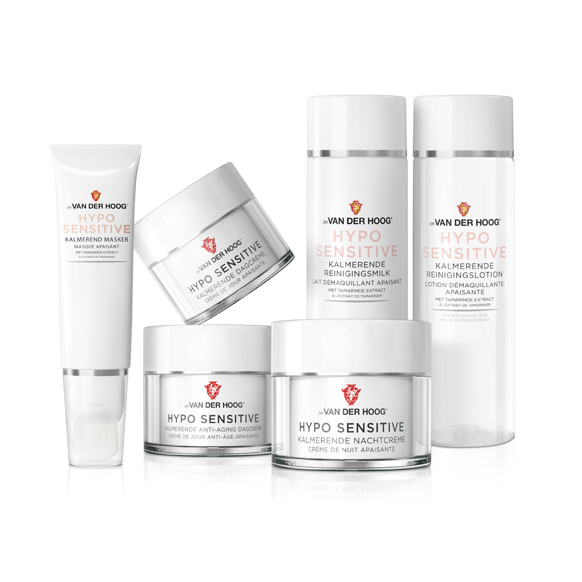
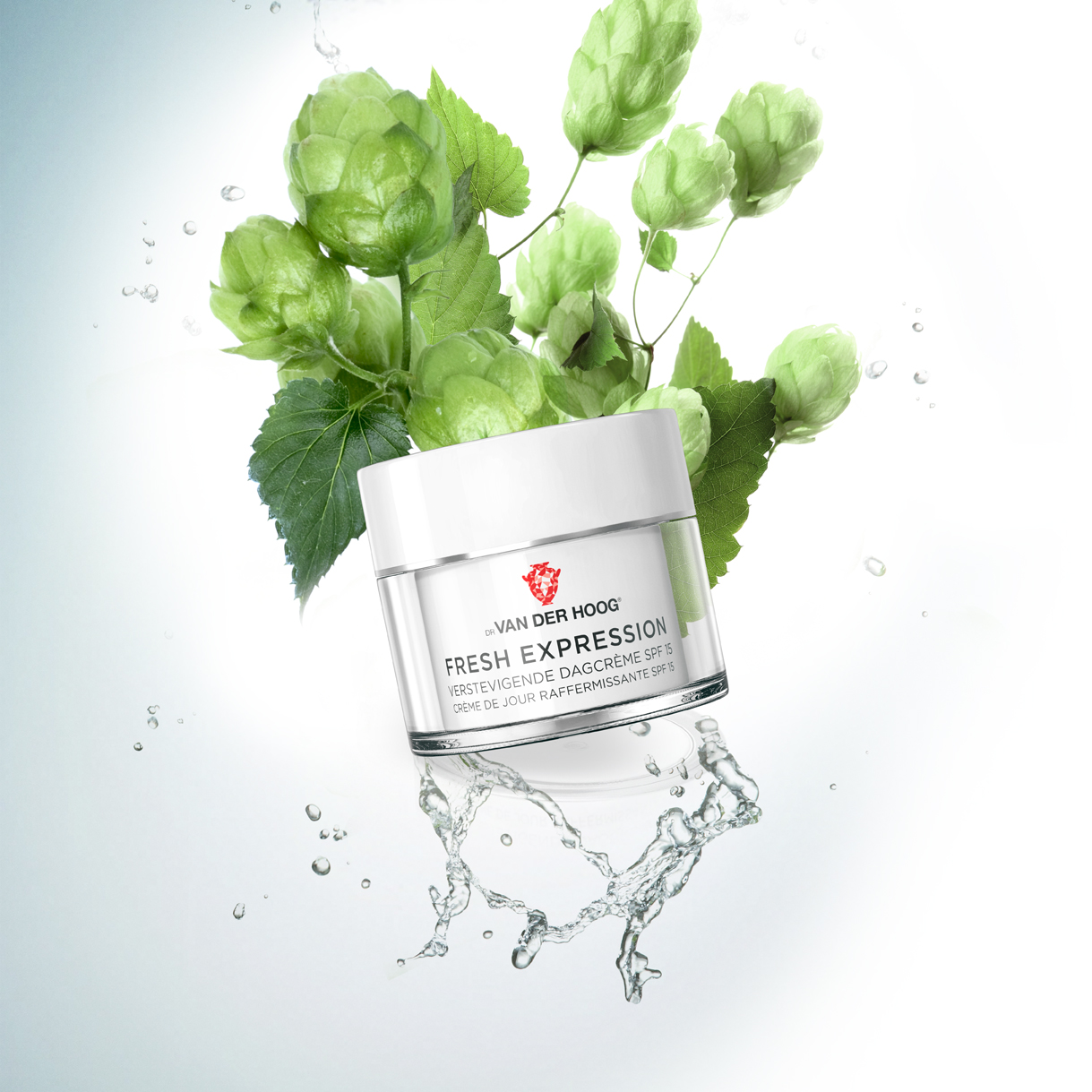
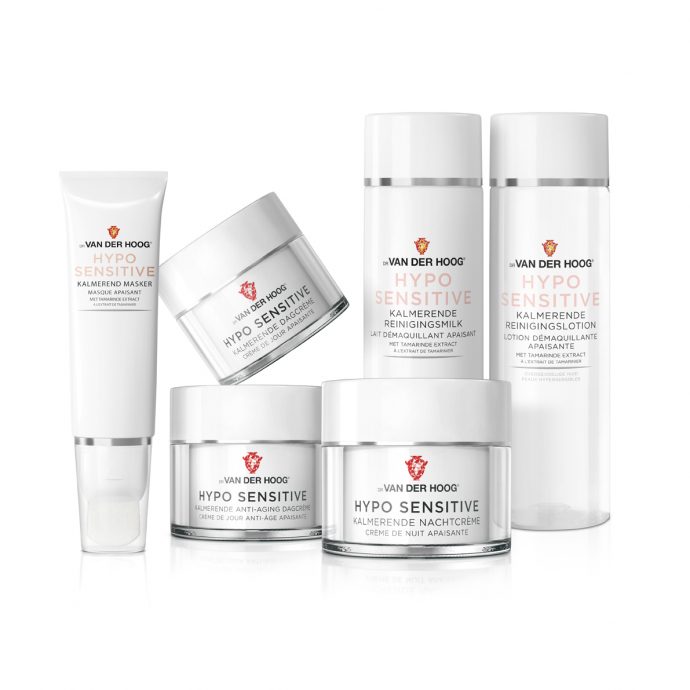
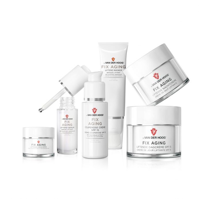
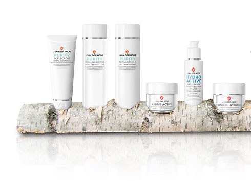
After this we translated the concept to a complete collection of more than 60 pack designs.
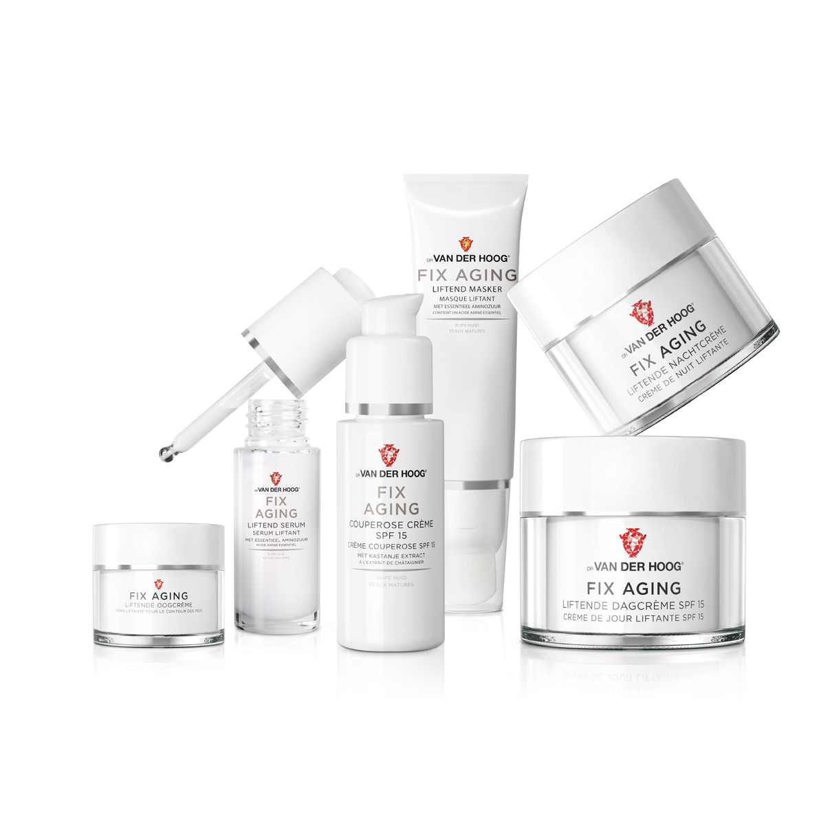
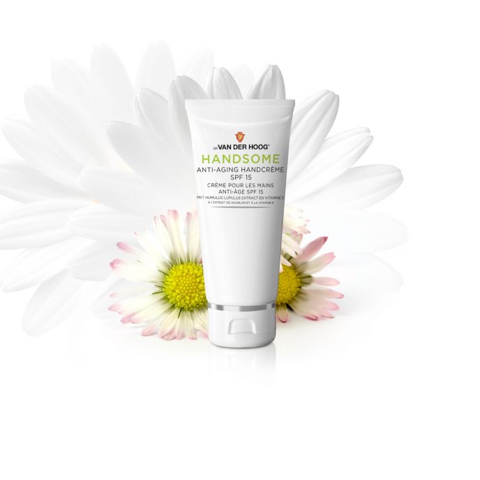
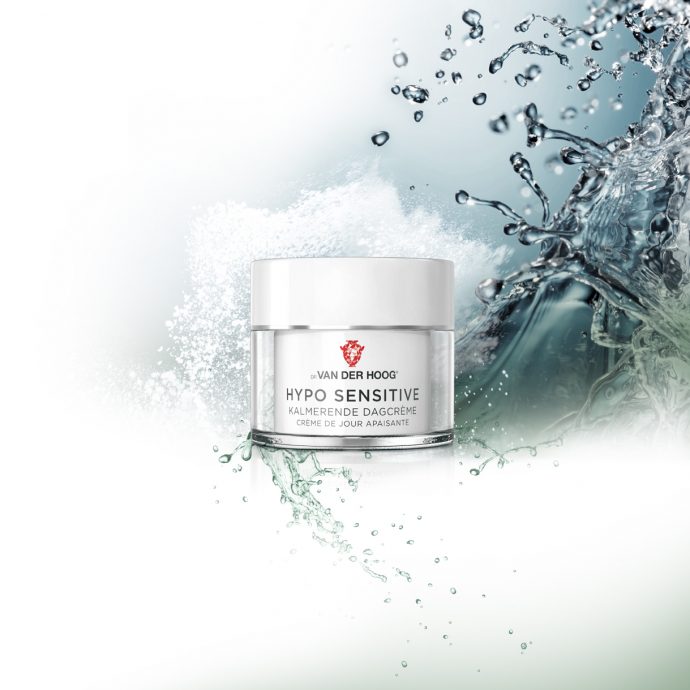
The moisturisers, products for facial skincare are a landmark for the brand and therefore a stylish pack design was created. The extraverted and colourful logo is in high contrast to the introverted layout and high gloss finishing of the packs. In a powerful centered design we used clear language describing the application of the product, what it does and what ingredients contribute to that. The tubes, flasks and jars are compact, but bold and feeling heavy. We refined the design with silver linings and a subtle embossing of the new brand logo.