


A whole new brand world for this skincare brand
ASSIGNMENT
Santesa asked us to reposition their Dermolin brand, which was considered very functional and empty in the growing market of special skin care.
APPROACH
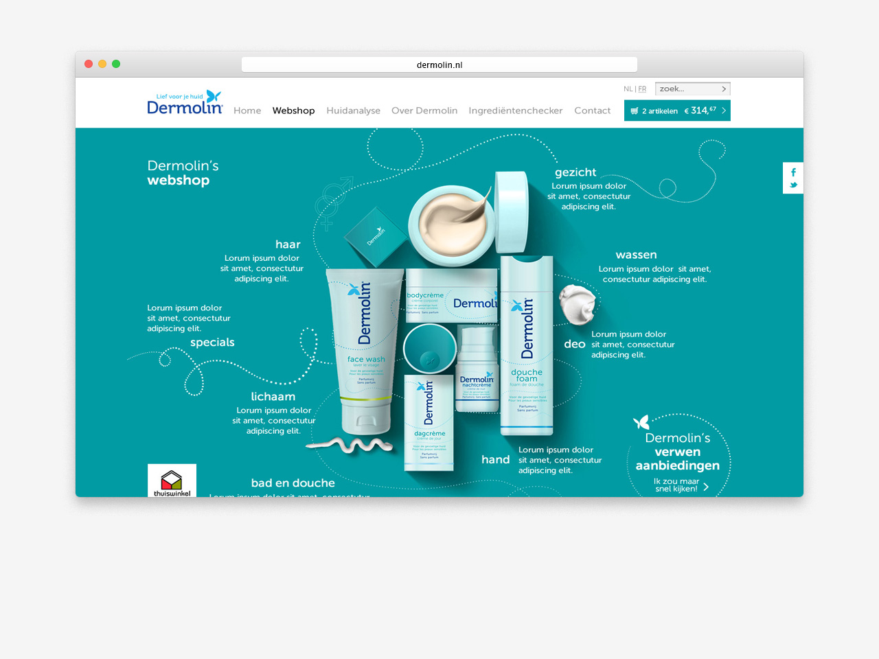
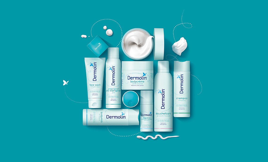
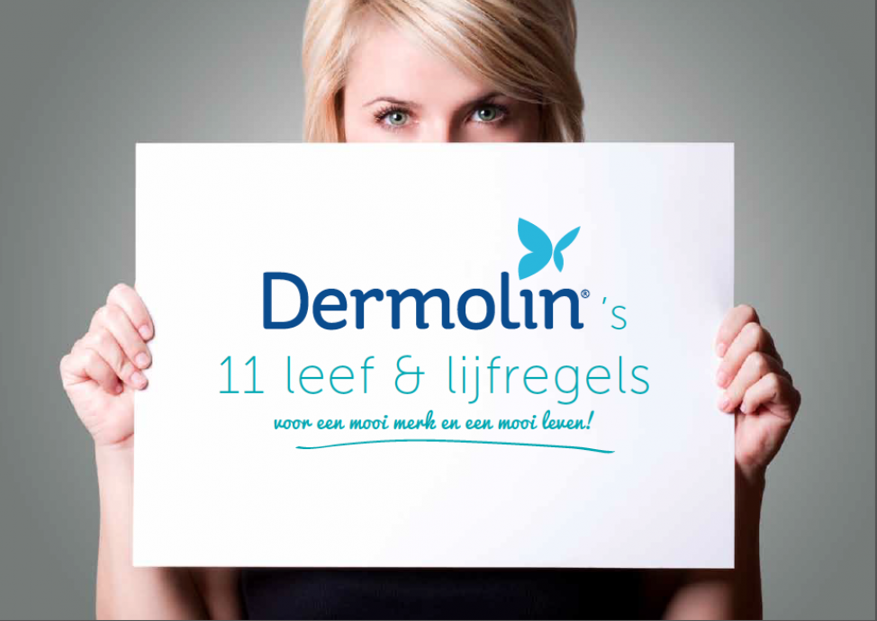
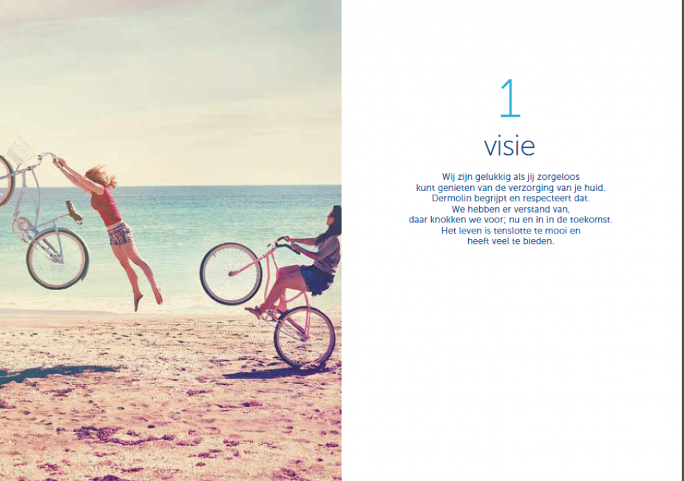
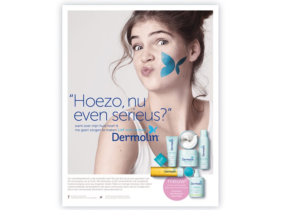
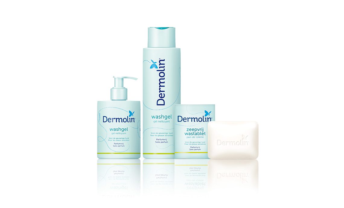
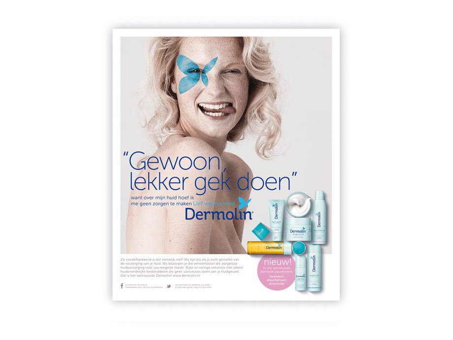
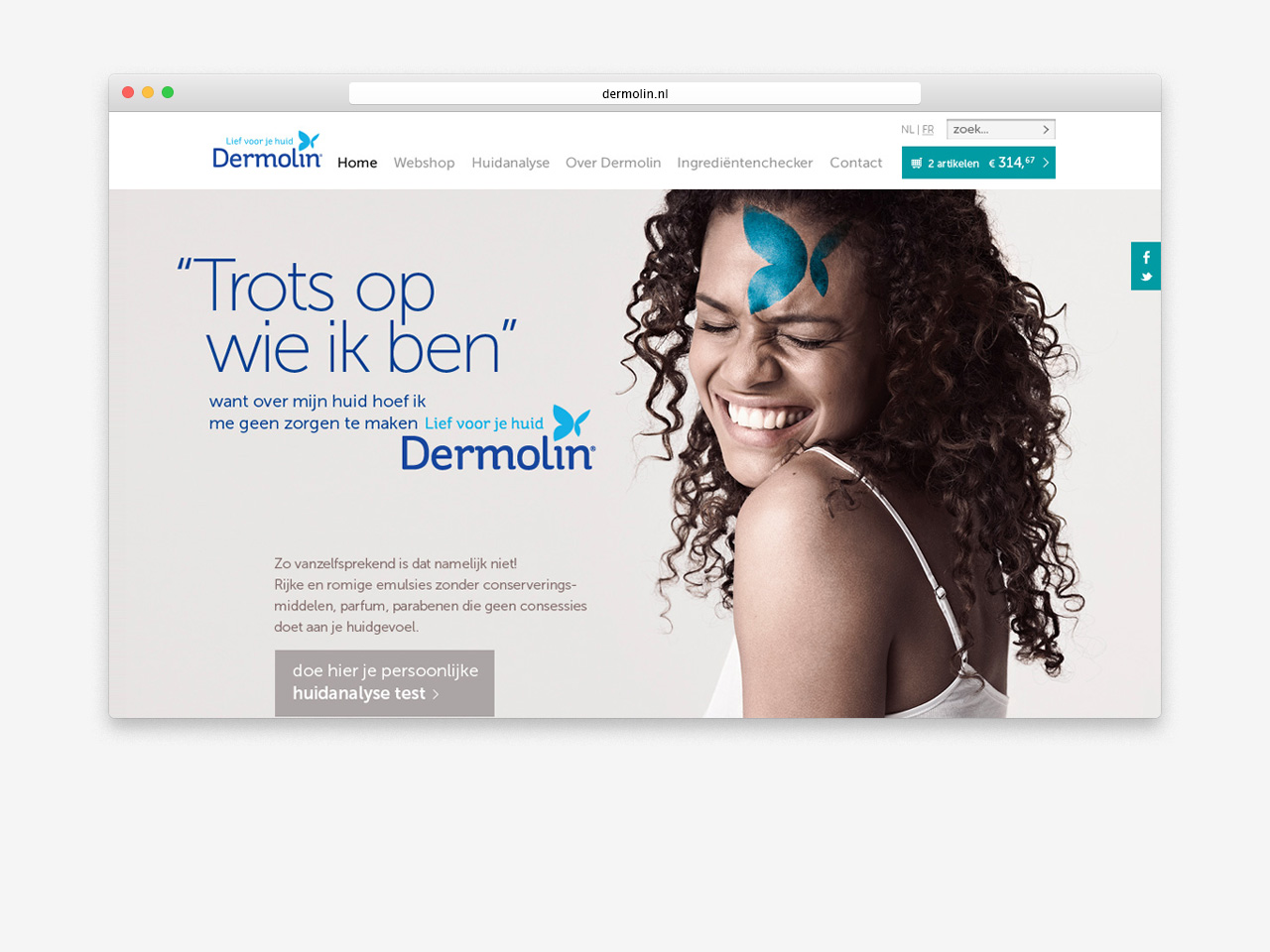
We analysed the brand and it's environment to come up with a new brand essence. From here we developed an inspiring brand book. Also we created a new brand identity and payoff ' sweet to your skin' representing the emotional positioning of a brand strong in solving skin issues. From here we started packaging design, communication, and the website including a webshop.
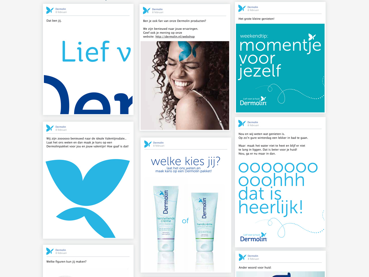
In the identity we see the butterfly as a refined icon, flying carefree through all communication items.
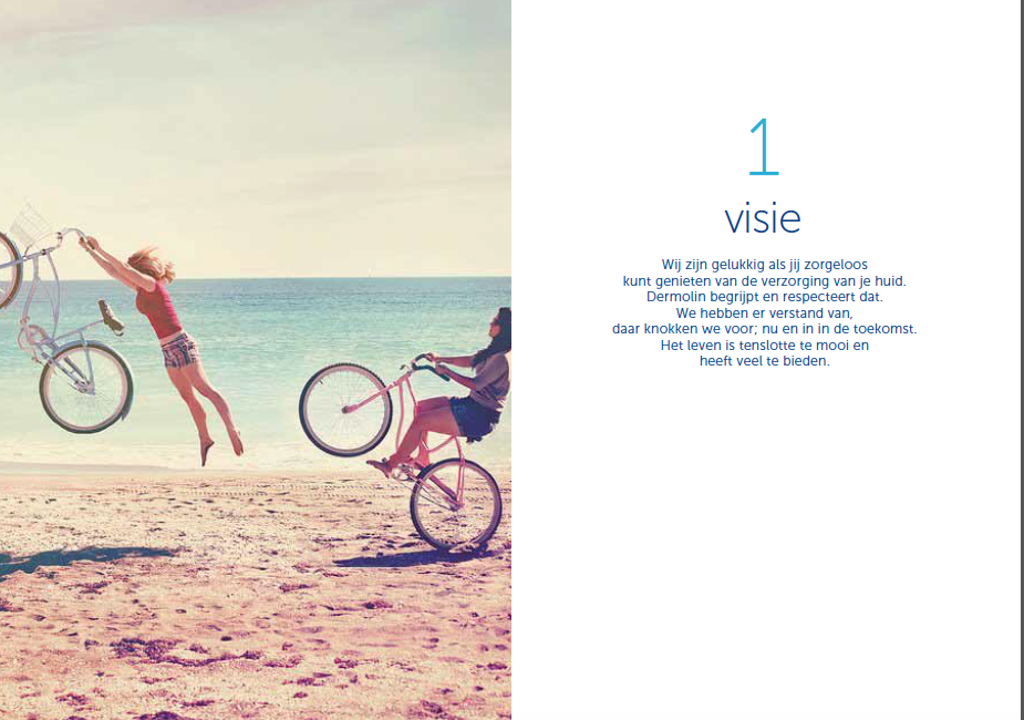
In photography we choose naturel models, sharing their pride and freedom.
In packaging we see a clean but warm monocolour design with a clear assortment structure.